 ISSEN
ISSEN 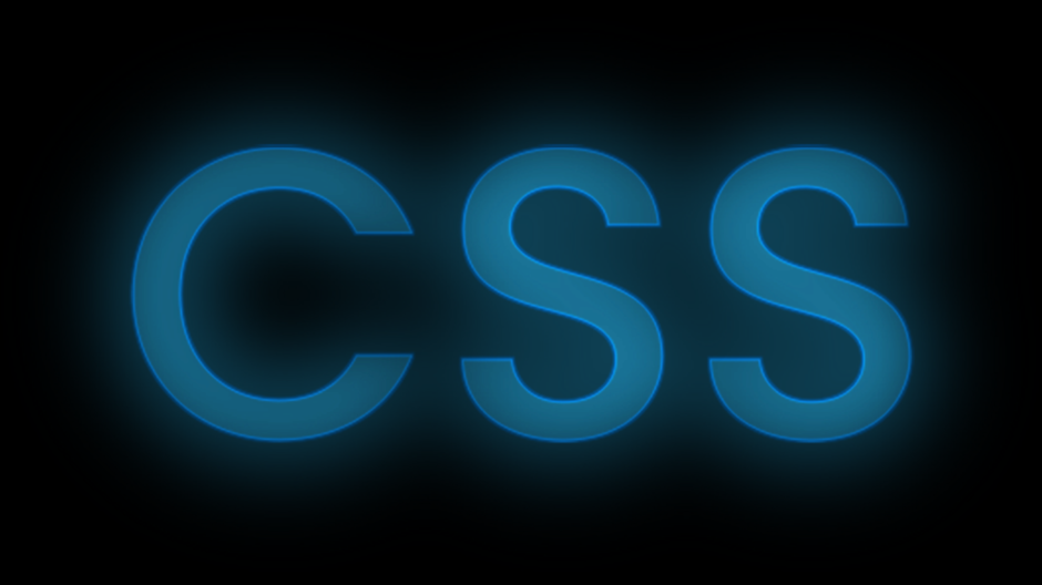
はじめに
この記事の概要
こんにちは、株式会社TOKOSのスギタです!
今回はCSSのみで行う、オープニングアニメーションを実装していきたいと思います!
コピペで使えるようにしていますので、最後まで見ていってください!
対象読者
- web制作でアニメーションの実装をしたい方
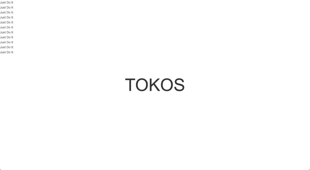
今回の完成予定
今回はCSSのみで行うオープニングアニメーションです。
少し複雑ですが、CSSのみでここまでできてしまうので、皆さんもぜひお試しください!
環境
動作確認環境は Chrome バージョン109 です。
今回はリセットCSSを使用しています。normalize.css です。
環境によっては多少スタイルが崩れる可能性があるので注意してください。
コードの紹介
HTML/CSS
<body>
  <div class="header">TOKOS</div>
  <div class="container">
    <div class="text-wrapper">
      <div class="text-1 text">Just Do It</div>
      <div class="text-2 text">Just Do It</div>
      <div class="text-3 text">Just Do It</div>
      <div class="text-4 text">Just Do It</div>
      <div class="text-5 text">Just Do It</div>
      <div class="text-6 text">Just Do It</div>
      <div class="text-7 text">Just Do It</div>
      <div class="text-8 text">Just Do It</div>
      <div class="text-9 text">Just Do It</div>
      <div class="text-10 text">Just Do It</div>
      <div class="text-11 text">Just Do It</div>
    </div>
  </div>
</body>
HTMLなのですが、最後に表示したいテキストと最初出てくるテキストを分けて書いてください!
CSSは手順ごとに説明していきます。
html,
body {
  margin: 0;
  padding: 0;
  width: 100%;
  height: 100vh;
}まずはhtmlタグとbodyタグに最低限のプロパティを当てていきます!
次に最後表示させたいテキストに対してスタイリングしていきます。
.header {
  position: absolute;
  top: 50%;
  left: 50%;
  transform: translate(-50%, -50%);
  font-family: Arial, Helvetica, sans-serif;
  font-size: 100px;
  z-index: -1;
}皆さん知っているとは思いますが、positionを使った際にtop:50%、left50%にしてから、transform: translate(-50%, -50%);を指定すると上下左右の真ん中に要素を配置するすることができます。
またz-indexを-1にすることで表示する重なりを一番下にしています!
真ん中に最後表示させたいテキストが表示されていたらOKです!
次に最初表示させたいテキストです。
.container {
  width: 100%;
  height: 100vh;
  margin: 0 auto;
  display: flex;
  justify-content: center;
  align-items: center;
  background-color: #000;
}

.text-wrapper {
  color: #fff;
  position: absolute;
}

.text {
  font-family: Arial, Helvetica, sans-serif;
  font-size: 54px;
  line-height: 1.2;
}

.text-1,
.text-3,
.text-4,
.text-8,
.text-9,
.text-11 {
  color: #000;
  -webkit-text-stroke: 1px #fff;
}
ここはお好きにスタイリングしてください!
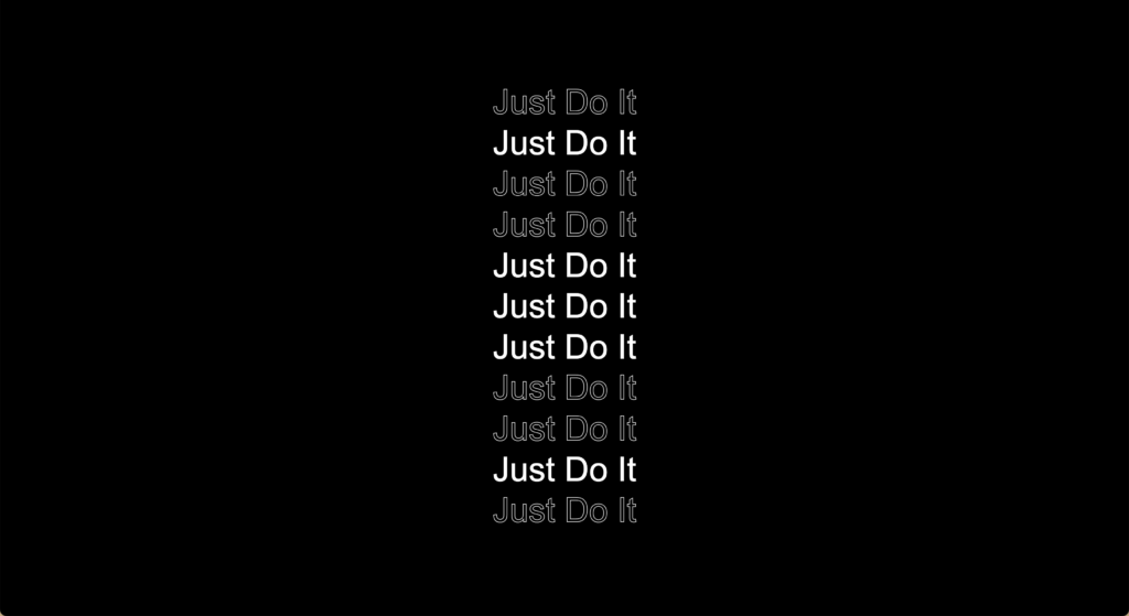
ここからはkeyframesを用いてアニメーションの指定に入っていきます。
基本的にはテキストの表示非表示を行って、各テキストに対して時間を少しずつずらして、連続するアニメーションを行っています。
まずは今回のアニメーションのkeyframesの基本的な動作からです。
@keyframes blink {
  0% {
    opacity: 0;
  }
  1% {
    opacity: 1;
  }
  99% {
    opacity: 1;
  }
  100% {
    opacity: 0;
  }
}
このアニメーションをもとに各クラスに遅延時間を指定していきます。
.text-1 {
  animation: blink 0.8s linear 0.9s, blink 0.8s linear 2s;
  opacity: 0;
}

.text-2 {
  animation: blink 0.8s linear 0.8s, blink 0.8s linear 2.1s;
  opacity: 0;
}

.text-3 {
  animation: blink 0.8s linear 0.7s, blink 0.8s linear 2.2s;
  opacity: 0;
}

.text-4 {
  animation: blink 0.8s linear 0.6s, blink 0.8s linear 2.3s;
  opacity: 0;
}

.text-5 {
  animation: blink 0.8s linear 0.5s, blink 0.8s linear 2.4s;
  opacity: 0;
}

.text-6 {
  animation: blink 0.8s linear 0.4s, blink 0.8s linear 2.5s,
    slide-out 1s linear 3.2s;
  opacity: 0;
}

.text-7 {
  animation: blink 0.8s linear 0.5s, blink 0.8s linear 2.4s;
  opacity: 0;
}

.text-8 {
  animation: blink 0.8s linear 0.6s, blink 0.8s linear 2.3s;
  opacity: 0;
}

.text-9 {
  animation: blink 0.8s linear 0.7s, blink 0.8s linear 2.2s;
  opacity: 0;
}

.text-10 {
  animation: blink 0.8s linear 0.8s, blink 0.8s linear 2.1s;
  opacity: 0;
}

.text-11 {
  animation: blink 0.8s linear 0.9s, blink 0.8s linear 2s;
  opacity: 0;
}こんな感じで真ん中のtext-6を中心に少しずつずらして指定していきます。
今省略記法で記入しています。省略せずに書くとこんな感じになります。
.text-1 {
  animation-name: blink;
  animation-duration: 0.8s;
  animation-timing-function: linear;
  animation-delay: 0.5s;
  opacity:0
}このアニメーション名blinkを2つ書いています。
また少しずつずらしている箇所はanimation-delayになっています。
これで流れて表示はできていると思います。
次にtext-6に指定しているアニメーション名slide-outです。
これが最後表示したり非表示にしたりを行っているアニメーションになります。
@keyframes slide-out {
  0% {
    opacity: 0;
  }
  1% {
    opacity: 1;
  }
  19% {
    opacity: 1;
  }
  20% {
    opacity: 0;
  }
  39% {
    opacity: 0;
  }
  40% {
    opacity: 1;
  }
  59% {
    opacity: 1;
  }
  60% {
    opacity: 0;
  }
  79% {
    opacity: 0;
  }
  80% {
    opacity: 1;
  }
  100% {
    opacity: 1;
  }
}
ここは何も考えずにコピペしてください!
最後に最初のテキストが流れて表示させた後の画面を切り替えるアニメーションになります。
まずはクラス名headerにanimationプロパティーを追加します。
.header {
  position: absolute;
  top: 50%;
  left: 50%;
  transform: translate(-50%, -50%);
  font-family: Arial, Helvetica, sans-serif;
  font-size: 100px;
  z-index: -1;
  animation: slide-out-container 4s cubic-bezier(0.97, 0.01, 0.36, 0.99) 2.8s;
  animation-fill-mode: forwards;
}

@keyframes slide-out-container {
  0% {
    height: 100vh;
  }
  40% {
    height: 100vh;
  }
  100% {
    height: 0%;
  }
}この中で、animation-timing-function: cubic-bezier(0.97, 0.01, 0.36, 0.99);が見慣れないと思いますが、イージングの調整を数値ベースで自分で調整することができます。ジェネレータもありますので使用してみてください!
これで実装完了です。
CSS部分少し長くなったのでまとめます!
html,
body {
  margin: 0;
  padding: 0;
  width: 100%;
  height: 100vh;
}

.header {
  position: absolute;
  top: 50%;
  left: 50%;
  transform: translate(-50%, -50%);
  font-family: Arial, Helvetica, sans-serif;
  text-transform: uppercase;
  font-size: 100px;
  z-index: -1;
}

.container {
  width: 100%;
  height: 100vh;
  margin: 0 auto;
  display: flex;
  justify-content: center;
  align-items: center;
  background-color: #000;
  animation: slide-out-container 4s cubic-bezier(0.97, 0.01, 0.36, 0.99) 2.8s;
  animation-fill-mode: forwards;
}

.text-wrapper {
  color: #fff;
  position: absolute;
}

.text {
  font-family: Arial, Helvetica, sans-serif;
  font-size: 54px;
  line-height: 1.2;
}

.text-1,
.text-3,
.text-4,
.text-8,
.text-9,
.text-11 {
  color: #000;
  -webkit-text-stroke: 1px #fff;
}

@keyframes blink {
  0% {
    opacity: 0;
  }
  1% {
    opacity: 1;
  }
  99% {
    opacity: 1;
  }
  100% {
    opacity: 0;
  }
}

.text-1 {
  animation: blink 0.8s linear 0.9s, blink 0.8s linear 2s;
  opacity: 0;
}

.text-2 {
  animation: blink 0.8s linear 0.8s, blink 0.8s linear 2.1s;
  opacity: 0;
}

.text-3 {
  animation: blink 0.8s linear 0.7s, blink 0.8s linear 2.2s;
  opacity: 0;
}

.text-4 {
  animation: blink 0.8s linear 0.6s, blink 0.8s linear 2.3s;
  opacity: 0;
}

.text-5 {
  animation: blink 0.8s linear 0.5s, blink 0.8s linear 2.4s;
  opacity: 0;
}

.text-6 {
  animation: blink 0.8s linear 0.4s, blink 0.8s linear 2.5s,
    slide-out 1s linear 3.2s;
  opacity: 0;
}

.text-7 {
  animation: blink 0.8s linear 0.5s, blink 0.8s linear 2.4s;
  opacity: 0;
}

.text-8 {
  animation: blink 0.8s linear 0.6s, blink 0.8s linear 2.3s;
  opacity: 0;
}

.text-9 {
  animation: blink 0.8s linear 0.7s, blink 0.8s linear 2.2s;
  opacity: 0;
}

.text-10 {
  animation: blink 0.8s linear 0.8s, blink 0.8s linear 2.1s;
  opacity: 0;
}

.text-11 {
  animation: blink 0.8s linear 0.9s, blink 0.8s linear 2s;
  opacity: 0;
}

@keyframes slide-out {
  0% {
    opacity: 0;
  }
  1% {
    opacity: 1;
  }
  19% {
    opacity: 1;
  }
  20% {
    opacity: 0;
  }
  39% {
    opacity: 0;
  }
  40% {
    opacity: 100%;
  }
  59% {
    opacity: 100%;
  }
  60% {
    opacity: 0;
  }
  79% {
    opacity: 0;
  }
  80% {
    opacity: 1;
  }
  100% {
    opacity: 1;
  }
}

@keyframes slide-out-container {
  0% {
    height: 100vh;
  }
  40% {
    height: 100vh;
  }
  100% {
    height: 0%;
  }
}
さいごに
今回はCSSのみでオープニングアニメーションを行ってみました。
CSSでも少々複雑にアニメーションを行うことができます。
delay時間等少々考えることは多いですが慣れれば問題ないかと思います!
皆さんもコピペで使っていただけると幸いです!