 ISSEN
ISSEN 
はじめに
この記事の概要
こんにちは、株式会社TOKOSのスギタです!
今回はGreenSock社のGreenSock Animation Platform(GSAP)を使い、オープニングアニメーションを実装していきたいと思います。GSAPの基本的な使い方は下記の記事を参考にしてください!!!
 【初学者向け】GSAPでテキストアニメーションをやってみた!!
対象読者
- web制作でアニメーションの実装をしたい方
今回の完成予定
今回はGSAPを用いてオープニングアニメーションを実装してみたいと思います!
GSAPのTimelineを使って実装していきます。
今回はHTML&CSSからJavaScriptまで手順を分け解説していきたいと思います。
環境
動作確認環境は Chrome バージョン113 です。
今回はリセットCSSを使用しています。normalize.css です。
環境によっては多少スタイルが崩れる可能性があるので注意してください。
コードの紹介
HTML&CSSの記述
HTML
<body>
 <header class="c-header">
  <div class="c-header__content">
   <p class="c-header__logo">TOKOS.inc</p>
   <div class="c-header__list">
    <a href="/" class="c-header__text --home">HOME</a></p>
    <a href="/" class="c-header__text --aboutus">ABOUT US</a>
    <a href="/" class="c-header__text --service">SERVICE</a>
    <a href="/" class="c-header__text --company">COMPANY</a>
    <a href="/" class="c-header__text --contact">CONTACT</a>
   </div>
  </div>
 </header>
 <main class="l-fv">
  <div class="c-fv__bg"></div>
  <div class="c-fv">
   <div class="c-fv__title">
    <p class="c-fv__text">CREATE</p>
    <p class="c-fv__text">PLAY</p>
    <p class="c-fv__text">ENJOY</p>
   </div>
   <div class="c-vertical">
    <p class="c-vertical__text js-line-text">Scroll Down</p>
    <div class="c-vertical__line js-line"></div>
   </div>
   <div class="c-horizontal">
    <p class="c-horizontal__text js-line-text">SINCE 2020 01 23 </p>
    <div class="c-horizontal__line js-line"></div>
     <p class="c-horizontal__text js-line-text">TODAY</p>
    </div>
    </div>
  </main>
</body>
全体のレイアウトを整えるCSS
/* ヘッダーのスタイリング */
.c-header {
  color: #fff;
  position: fixed;
  top: 0;
  z-index: 10;
  width: 100vw;
}

.c-header__content {
  max-width: 1200px;
  margin: auto;
  padding: 20px 0;
  display: flex;
  justify-content: space-between;
  align-items: center;
}

.c-header__logo {
  font-size: 24px;
  font-weight: 600;
}

.c-header__list {
  display: flex;
}

.c-header__text {
  padding: 4px;
  font-size: 20px;
  font-family: "Times New Roman", Times, serif;
  margin-left: 12px;
  color: #fff;
}

.c-header__text:first-of-type {
  margin-left: 0px;
}

/* ファーストビューのスタイリング */
.l-fv {
  height: 100vh;
  color: #fff;
  position: relative;
  background-image: url("./image/issen-gsap-demo.jpg");
}

.c-fv {
  max-width: 1200px;
  margin: auto;
}

.c-fv__title {
  font-size: 64px;
  font-weight: 600;
  font-family: "Times New Roman", Times, serif;
  position: absolute;
  top: 50%;
  transform: translateY(-50%);
}

/* 縦線のアニメーション */
.c-vertical {
  position: absolute;
  bottom: 0;
}

.c-vertical__text {
  font-size: 14px;
  width: fit-content;
  writing-mode: vertical-rl;
  margin-bottom: 12px;
  letter-spacing: 0.1em;
  font-weight: 500px;
  font-family: "Times New Roman", Times, serif;
  opacity: 0;
}

.c-vertical__line {
  display: block;
  width: 1px;
  height: 100px;
  background-color: #fff;
  position: relative;
  left: 10px;
  animation: vertical-line 2.5s cubic-bezier(1, 0, 0, 1) infinite;
  opacity: 0;
}

@keyframes vertical-line {
  0% {
    transform: scale(1, 0);
    transform-origin: 0 0;
  }
  50% {
    transform: scale(1, 1);
    transform-origin: 0 0;
  }
  50.1% {
    transform: scale(1, 1);
    transform-origin: 0 100%;
  }
  100% {
    transform: scale(1, 0);
    transform-origin: 0 100%;
  }
}

/* 横線のアニメーション */
.c-horizontal {
  display: flex;
  align-items: center;
}

.c-horizontal__text {
  gap: 0px 8px;
  font-size: 14px;
  z-index: 200;
  letter-spacing: 0.1em;
  font-weight: 500px;
  font-family: "Times New Roman", Times, serif;
  opacity: 0;
}

.c-horizontal__text:first-of-type {
  margin-right: 12px;
}

.c-horizontal__text:last-of-type {
  margin-left: 12px;
}

.c-horizontal {
  position: absolute;
  top: 140px;
}

.c-horizontal__line {
  display: block;
  width: 100px;
  height: 1px;
  background-color: #fff;
  z-index: 10;
  transform: rotateZ(90deg);
  animation: horizontal-line 2.5s cubic-bezier(1, 0, 0, 1) infinite;
  opacity: 0;
}

@keyframes horizontal-line {
  0% {
    transform: scale(0, 1);
    transform-origin: 0 0;
  }
  50% {
    transform: scale(1, 1);
    transform-origin: 0 0;
  }
  50.1% {
    transform: scale(1, 1);
    transform-origin: 100% 0;
  }
  100% {
    transform: scale(0, 1);
    transform-origin: 100% 0;
  }
}

/* 背景画像のマスクアニメーション用のスタイル */
.c-fv__bg {
  width: 100vw;
  height: 100vh;
  position: absolute;
  top: 0;
  left: 0;
  background-color: #000;
}
これで全体のレイアウトは一旦OKです!
ここからTimelineでアニメーションをつなげる前のテキストアニメーションを作成していきたいと思います!
テキストアニメーションの作成
今から紹介するテキストアニメーションはSplitTypeというGSAPとは別のライブラリも使用します。
SplitTypeを使うとテキストを分割してくれます。
yarn/npmまたはCDNお好きな方法で使用してください!

yarn/npm
yarn add 'split-type'import SplitType from 'split-type'CDN
<script src="https://unpkg.com/split-type"></script>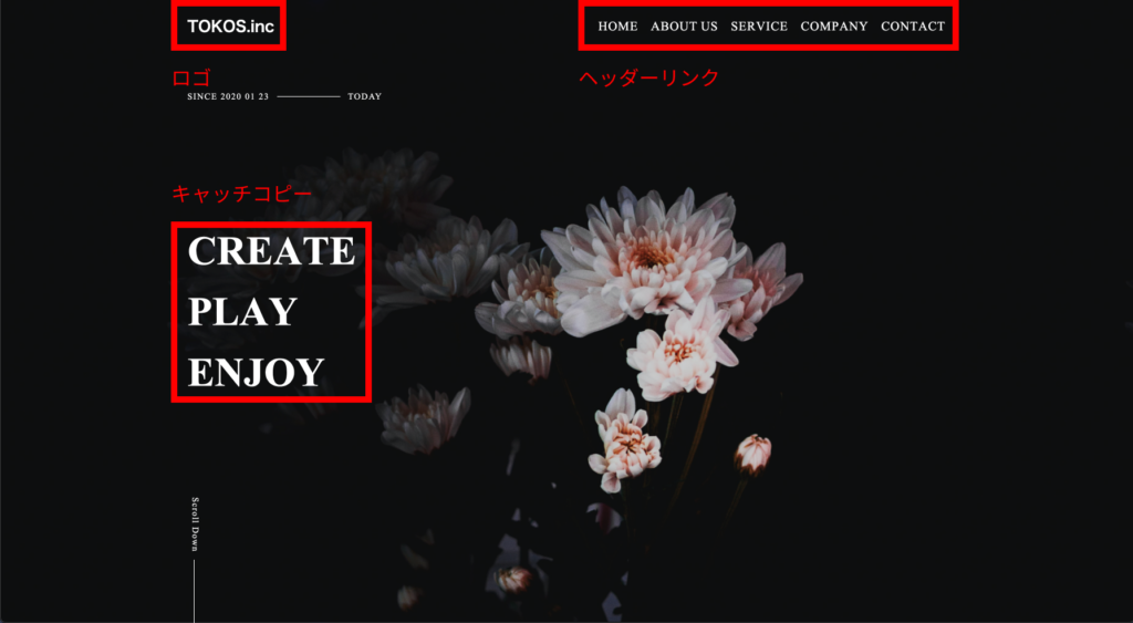
インストールできたらアニメーションを施したい三箇所(ロゴ、ヘッダーリンク、キャッチコピー)にSplitTypeを使用したいと思います。
const fvText = new SplitType(".c-fv__text");
const headerText = new SplitType(".c-header__text");
const logo = new SplitType(".c-header__logo");
これで準備完了です。
まずはヘッダーリンクとキャッチコピーのテキストアニメーションから行っていきます。
まずはアニメーション用ににCSSを追記します。
/* テキストアニメーションの記述 */
/* ヘッダー側 */
.c-header__text {
  clip-path: polygon(0 0, 100% 0, 100% 100%, 0% 100%);
  line-height: 1;
}

/* ヘッダー側 */
.c-fv__text {
  clip-path: polygon(0 0, 100% 0, 100% 100%, 0% 100%);
  line-height: 1;
  margin-top: 32px;
}

.c-fv__text:first-of-type {
  margin-top: 0px;
}

.c-fv__text .char {
  transform: translateY(100px);
  transition: transform 0.5s;
}

.c-header__text .char {
  transform: translateY(-100px);
  transition: transform 0.5s;
  /* 文字間の調整 */
  margin-left: 1px;
}クラス名の.charはSplitTypeで分割後のクラス名になります。
気になる方はdevツールで見てみてください!
画面は今何も写っていないと思います。これで、アニメーション前の準備は完了です、
ここからGSAPでアニメーションを施してきたいと思います。
/* ヘッダーリンクのアニメーション */
  gsap.to(".c-header__text.--home .char", {
    y: 0 /*テキストのY軸の操作*/,
    stagger: 0.1 /*テキスト間の遅延時間*/,
    duration: 0.5 /*アニメーションの時間*/,
    ease: Power2.easeInOut,
  });
  gsap.to(".c-header__text.--aboutus .char", {
    y: 0 /*テキストのY軸の操作*/,
    stagger: 0.1 /*テキスト間の遅延時間*/,
    duration: 0.5 /*アニメーションの時間*/,
    ease: Power2.easeInOut,
  });
  gsap.to(".c-header__text.--service .char", {
    y: 0 /*テキストのY軸の操作*/,
    stagger: 0.1 /*テキスト間の遅延時間*/,
    duration: 0.5 /*アニメーションの時間*/,
    ease: Power2.easeInOut,
  });
  gsap.to(".c-header__text.--company .char", {
    y: 0 /*テキストのY軸の操作*/,
    stagger: 0.1 /*テキスト間の遅延時間*/,
    duration: 0.5 /*アニメーションの時間*/,
    ease: Power2.easeInOut,
  });
  gsap.to(".c-header__text.--contact .char", {
    y: 0 /*テキストのY軸の操作*/,
    stagger: 0.1 /*テキスト間の遅延時間*/,
    duration: 0.5 /*アニメーションの時間*/,
    ease: Power2.easeInOut,
  });

/* キャッチコピーのアニメーション */
gsap.to(fvText.chars, {
  y: 0 /*テキストのY軸の操作*/,
  stagger: 0.05 /*テキスト間の遅延時間*/,
  duration: 1 /*アニメーションの時間*/,
  ease: Power2.easeInOut,
});
これでヘッダーリンクとキャッチコピー部分のアニメーションは完了です。
ちなみに下記で細かく説明していますので合わせて見ていただければと思います🙇♂️
 【GSAP】コピペでOK!!GSAPテキストアニメーションの実装
次にロゴのテキストアニメーションです。
gsap.fromTo(
  logo.chars,
  {
    autoAlpha: 0 /*opacity+visibility:hidden;*/,
  },
  {
    autoAlpha: 1 /*opacity+visibility:inherit;*/,
    stagger: 0.05 /*テキスト間の遅延時間*/,
    duration: 1 /*アニメーションの時間*/,
    ease: Power2.easeInOut,
  }
)テキストにstaggerプロパティで一文字ずつ遅延をかけ、opacityでフェードインさせるシンプルなものになります。
これでテキストアニメーションの完了になります。
Timelineでアニメーションをつなぐ
ここからアニメーションをつないでいきます。
アニメーションの順番は下記になります。
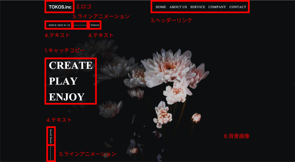
Timelineを使用するにあたって、3番のヘッダーリンクのテキストアニメーションをTimeline内に書くと見通しが悪くなるので、予め関数に中に入れておきます。
const headerAnimation = () => {
  /* ヘッダーリンクのアニメーション */
  gsap.to(".c-header__text.--home .char", {
    y: 0,
    stagger: 0.1,
    duration: 0.5,
    ease: Power2.easeInOut,
  });
  gsap.to(".c-header__text.--aboutus .char", {
    y: 0,
    stagger: 0.1,
    duration: 0.5,
    ease: Power2.easeInOut,
  });
  gsap.to(".c-header__text.--service .char", {
    y: 0,
    stagger: 0.1,
    duration: 0.5,
    ease: Power2.easeInOut,
  });
  gsap.to(".c-header__text.--company .char", {
    y: 0,
    stagger: 0.1,
    duration: 0.5,
    ease: Power2.easeInOut,
  });
  gsap.to(".c-header__text.--contact .char", {
    y: 0,
    stagger: 0.1,
    duration: 0.5,
    ease: Power2.easeInOut,
  });
};
これで準備は完了です。
あとはTimelineでつないでいきます!
const tl = gsap.timeline();
/*1.キャッチコピーのテキストアニメーション*/
tl.to(fvText.chars, {
  y: 0,
  stagger: 0.05,
  duration: 1,
  ease: Power2.easeInOut,
})
  /*2.ロゴのテキストアニメーション*/
  .fromTo(
    logo.chars,
    {
      autoAlpha: 0,
    },
    {
      autoAlpha: 1,
      stagger: 0.05,
      duration: 1,
      ease: Power2.easeInOut,
    }
  )
  /*3.ヘッダーのテキストリンクのテキストアニメーション*/
  .call(headerAnimation)
  /*4.テキストの表示*/
  .to(".js-line-text", {
    delay: 0.5,
    autoAlpha: 1,
    duration: 2,
    ease: Power2.easeOut,
  })
  /*5.ラインアニメーションの表示*/
  .to(".js-line", {
    autoAlpha: 1,
  })
  /*6.背景画像の表示*/
  .fromTo(
    ".c-fv__bg",
    {
      autoAlpha: 1,
    },
    {
      duration: 1,
      autoAlpha: 0.2,
      ease: Power2.easeOut,
    },
    ">-1" /*前のアニメーションが終わる1秒前にアニメーションの開始*/
  );
上から、順番通りアニメーションをつないでいってます。
関数を呼び出すのは、callメソッドを使用します。
第一引数に、コールバック関数、第二引数に、パラメータの配列(デフォルトはnull)、第三引数に、※ポジション(アニメーション開始時の時間の操作)になります。

各アニメーションのイージングや第三引数の※ポジションを変えると印象も変わってくると思います。
※ポジションの指定方法例を下記まとめてみました、参考にしていただければと思います。
・”+ = 3″ Timelineが開始から3秒後に実行
・”- = 3″ Timelineが終了から3秒前に実行
・”< + 3″(<3と同じ) 前のアニメーション開始から3秒後に実行
・”> – 3″ 前のアニメーション終了3秒前に実行
上記以外にも様々な方法で指定できるので、気になる方は下記を参考にしてみてください。
全体のコード
HTML
<body>
 <header class="c-header">
  <div class="c-header__content">
   <p class="c-header__logo">TOKOS.inc</p>
   <div class="c-header__list">
    <a href="/" class="c-header__text --home">HOME</a></p>
    <a href="/" class="c-header__text --aboutus">ABOUT US</a>
    <a href="/" class="c-header__text --service">SERVICE</a>
    <a href="/" class="c-header__text --company">COMPANY</a>
    <a href="/" class="c-header__text --contact">CONTACT</a>
   </div>
  </div>
 </header>
 <main class="l-fv">
  <div class="c-fv__bg"></div>
  <div class="c-fv">
   <div class="c-fv__title">
    <p class="c-fv__text">CREATE</p>
    <p class="c-fv__text">PLAY</p>
    <p class="c-fv__text">ENJOY</p>
   </div>
   <div class="c-vertical">
    <p class="c-vertical__text js-line-text">Scroll Down</p>
    <div class="c-vertical__line js-line"></div>
   </div>
   <div class="c-horizontal">
    <p class="c-horizontal__text js-line-text">SINCE 2020 01 23 </p>
    <div class="c-horizontal__line js-line"></div>
     <p class="c-horizontal__text js-line-text">TODAY</p>
    </div>
    </div>
  </main>
</body>
css
/* ヘッダーのスタイリング */
.c-header {
  color: #fff;
  position: fixed;
  top: 0;
  z-index: 10;
  width: 100vw;
}

.c-header__content {
  max-width: 1200px;
  margin: auto;
  padding: 20px 0;
  display: flex;
  justify-content: space-between;
  align-items: center;
}

.c-header__logo {
  font-size: 24px;
  font-weight: 600;
}

.c-header__list {
  display: flex;
}

.c-header__text {
  padding: 4px;
  font-size: 20px;
  font-family: "Times New Roman", Times, serif;
  margin-left: 12px;
  color: #fff;
}

.c-header__text:first-of-type {
  margin-left: 0px;
}

/* ファーストビューのスタイリング */
.l-fv {
  height: 100vh;
  color: #fff;
  position: relative;
  background-image: url("./image/issen-gsap-demo.jpg");
}

.c-fv {
  max-width: 1200px;
  margin: auto;
}

.c-fv__title {
  font-size: 64px;
  font-weight: 600;
  font-family: "Times New Roman", Times, serif;
  position: absolute;
  top: 50%;
  transform: translateY(-50%);
}

/* 縦線のアニメーション */
.c-vertical {
  position: absolute;
  bottom: 0;
}

.c-vertical__text {
  font-size: 14px;
  width: fit-content;
  writing-mode: vertical-rl;
  margin-bottom: 12px;
  letter-spacing: 0.1em;
  font-weight: 500px;
  font-family: "Times New Roman", Times, serif;
  opacity: 0;
}

.c-vertical__line {
  display: block;
  width: 1px;
  height: 100px;
  background-color: #fff;
  position: relative;
  left: 10px;
  animation: vertical-line 2.5s cubic-bezier(1, 0, 0, 1) infinite;
  opacity: 0;
}

@keyframes vertical-line {
  0% {
    transform: scale(1, 0);
    transform-origin: 0 0;
  }
  50% {
    transform: scale(1, 1);
    transform-origin: 0 0;
  }
  50.1% {
    transform: scale(1, 1);
    transform-origin: 0 100%;
  }
  100% {
    transform: scale(1, 0);
    transform-origin: 0 100%;
  }
}

/* 横線のアニメーション */
.c-horizontal {
  display: flex;
  align-items: center;
}

.c-horizontal__text {
  gap: 0px 8px;
  font-size: 14px;
  z-index: 200;
  letter-spacing: 0.1em;
  font-weight: 500px;
  font-family: "Times New Roman", Times, serif;
  opacity: 0;
}

.c-horizontal__text:first-of-type {
  margin-right: 12px;
}

.c-horizontal__text:last-of-type {
  margin-left: 12px;
}

.c-horizontal {
  position: absolute;
  top: 140px;
}

.c-horizontal__line {
  display: block;
  width: 100px;
  height: 1px;
  background-color: #fff;
  z-index: 10;
  transform: rotateZ(90deg);
  animation: horizontal-line 2.5s cubic-bezier(1, 0, 0, 1) infinite;
  opacity: 0;
}

@keyframes horizontal-line {
  0% {
    transform: scale(0, 1);
    transform-origin: 0 0;
  }
  50% {
    transform: scale(1, 1);
    transform-origin: 0 0;
  }
  50.1% {
    transform: scale(1, 1);
    transform-origin: 100% 0;
  }
  100% {
    transform: scale(0, 1);
    transform-origin: 100% 0;
  }
}

/* テキストアニメーションの記述 */
/* ヘッダー側 */
.c-header__text {
  clip-path: polygon(0 0, 100% 0, 100% 100%, 0% 100%);
  line-height: 1;
}

/* ヘッダー側 */
.c-fv__text {
  clip-path: polygon(0 0, 100% 0, 100% 100%, 0% 100%);
  line-height: 1;
  margin-top: 32px;
}

.c-fv__text:first-of-type {
  margin-top: 0px;
}

.c-fv__text .char {
  transform: translateY(100px);
  transition: transform 0.5s;
}

.c-header__text .char {
  transform: translateY(-100px);
  transition: transform 0.5s;
  /* 文字間の調整 */
  margin-left: 1px;
}

/* 背景画像のマスクアニメーション用のスタイル */
.c-fv__bg {
  width: 100vw;
  height: 100vh;
  position: absolute;
  top: 0;
  left: 0;
  background-color: #000;
}
JavaScript
const fvText = new SplitType(".c-fv__text");
const headerText = new SplitType(".c-header__text");
const logo = new SplitType(".c-header__logo");

const headerAnimation = () => {
  /* ヘッダーリンクのアニメーション */
  gsap.to(".c-header__text.--home .char", {
    y: 0,
    stagger: 0.1,
    duration: 0.5,
    ease: Power2.easeInOut,
  });
  gsap.to(".c-header__text.--aboutus .char", {
    y: 0,
    stagger: 0.1,
    duration: 0.5,
    ease: Power2.easeInOut,
  });
  gsap.to(".c-header__text.--service .char", {
    y: 0,
    stagger: 0.1,
    duration: 0.5,
    ease: Power2.easeInOut,
  });
  gsap.to(".c-header__text.--company .char", {
    y: 0,
    stagger: 0.1,
    duration: 0.5,
    ease: Power2.easeInOut,
  });
  gsap.to(".c-header__text.--contact .char", {
    y: 0,
    stagger: 0.1,
    duration: 0.5,
    ease: Power2.easeInOut,
  });
};

const tl = gsap.timeline();
/*1.キャッチコピーのテキストアニメーション*/
tl.to(fvText.chars, {
  y: 0,
  stagger: 0.05,
  duration: 1,
  ease: Power2.easeInOut,
})
  /*2.ロゴのテキストアニメーション*/
  .fromTo(
    logo.chars,
    {
      autoAlpha: 0,
    },
    {
      autoAlpha: 1,
      stagger: 0.05,
      duration: 1,
      ease: Power2.easeInOut,
    }
  )
  /*3.ヘッダーのテキストリンクのテキストアニメーション*/
  .call(headerAnimation)
  /*4.テキストの表示*/
  .to(".js-line-text", {
    delay: 0.5,
    autoAlpha: 1,
    duration: 2,
    ease: Power2.easeOut,
  })
  /*5.ラインアニメーションの表示*/
  .to(".js-line", {
    autoAlpha: 1,
  })
  /*6.背景画像の表示*/
  .fromTo(
    ".c-fv__bg",
    {
      autoAlpha: 1,
    },
    {
      duration: 1,
      autoAlpha: 0.2,
      ease: Power2.easeOut,
    },
    ">-1" /*前のアニメーションが終わる1秒前にアニメーションの開始*/
  );
さいごに
すこし説明が長くなりましたが、コード量に関してはかなり少ないと思います。
今回は紹介できなかったですが様々なメソッドのおかげで複雑なアニメーションも簡単に実装できると思います。
初学者の方でも簡単に実装できるのがGSAPの良いところだと思います!